The first sign that a dashboard is failing isn't a missing chart. It's the supervisor who's staring at a wallboard during a call spike, sees service level drop, sees the queue grow, and still can't tell whether to pull back-office staff, change routing, or start callbacks. That's the gap between a dashboard that looks informed and one that helps a team act.
Good call center dashboards work like an operational control panel. They surface the few numbers that matter, show whether the problem is queue congestion, slow handling, or repeat contacts, and give a supervisor enough context to intervene while the volume is still moving. If you also need a practical example of how teams can drive growth with call analytics, the workflow behind drive growth with call analytics is a useful reference point for thinking about action, not just visibility.
Why Most Call Center Dashboards Fail to Drive Action
The failure mode is usually obvious once you've lived through it. A supervisor opens a screen packed with charts, gauges, and color blocks, but the dashboard doesn't say what changed, who owns it, or what threshold matters. It's a report disguised as a control room.
The core mistake is treating metrics as the end product. In practice, service level, ASA, abandon rate, and AHT are valuable because they signal queue health and staffing pressure, not because they make the screen look complete. A dashboard earns its keep when it tells a supervisor whether waits are drifting, whether the queue is backing up, and whether the team should react right now.
A dashboard should trigger a decision
A useful screen answers a simple operational question. If the service-level target slips, the supervisor should know whether the issue is too much volume, long hold times, or too few available agents. That's why the benchmark of 80% of calls answered in 20 seconds matters in common contact-center practice, because it gives the team a live threshold to act against rather than a vague performance mood. Nextiva's dashboard guidance shows this shift from monthly reporting to real-time management.
Practical rule: if a metric doesn't lead to an owner, a threshold, and a next move, it doesn't belong on the real-time view.
That's also where many teams go wrong with analytics projects. They collect more data than they can use, then wonder why the wallboard never changes behavior. If the dashboard doesn't help the supervisor decide whether to rebalance staffing, adjust routing, or trigger callbacks, it's just decoration.
Actionability beats display quality
A polished dashboard can still be useless. You can have flawless charts, live colors, and clean typography, and still fail if the screen doesn't connect a signal to a response. The better standard is whether the dashboard supports intervention before the queue becomes a customer experience problem.
That's why the best implementations I've seen define a metric, assign ownership, and write down what happens when the number moves. Once that discipline exists, the dashboard stops being a passive summary and starts functioning like the operational tool it should be.
The Five Foundational KPIs Every Dashboard Must Track
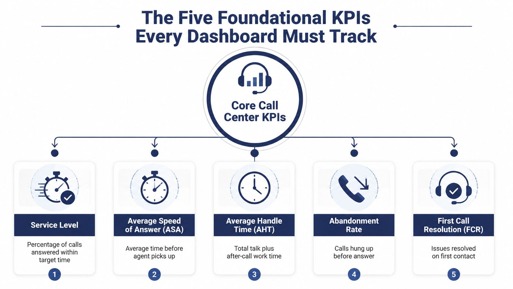
The dashboard only becomes useful when the team agrees on a small core of metrics that explain what's happening in the queue. In most contact centers, that means service level, average speed of answer (ASA), average handle time (AHT), abandonment rate, and first-call resolution (FCR). These aren't decorative KPIs. They describe whether demand is outrunning capacity, whether agents are moving efficiently, and whether customers are coming back because the first contact didn't solve the issue.
Read the five metrics as one system
Service level tells you whether the team is meeting response expectations. ASA shows how long customers wait before someone picks up. AHT captures talk time, hold time, and wrap-up work, so it reflects how much effort each contact consumes. Abandonment rate shows how many callers give up before answer, and FCR shows whether the issue was resolved on the first contact.
Used together, the five metrics tell a much richer story than any one of them alone. Rising AHT with falling service level usually points to handling inefficiency or complicated contacts. A spike in abandonment without a major AHT change often points to queue pressure or coverage gaps. That's why the dashboard needs drill-downs from summary KPI to queue, team, agent, and call-type detail, as shown in the average handle time guide.
When the numbers move together, don't ask which one is “bad.” Ask which part of the workflow changed first.
What each KPI reveals in practice
A strong supervisor reads these measures as operational clues, not scorecards.
- Service Level: Tells you whether response targets are being met and whether waits are trending the wrong way.
- ASA: Reveals how long customers sit in the queue before an agent answers.
- AHT: Shows whether the team is spending too long on each contact, including after-call work.
- Abandonment Rate: Flags how many customers leave before they're helped.
- FCR: Highlights whether repeat contacts are being created by unresolved issues.
The important part is the relationship between them. A high service level with weak FCR can still hide poor customer outcomes. A low AHT with rising abandonment can mean agents are rushing, not helping. The dashboard has to support root-cause analysis, not just scorekeeping.
The visuals should support drill-down
A summary tile is only the start. Mature dashboards let supervisors move from a high-level alert into queue-level and agent-level detail without leaving the screen. That's where the work happens, because the metric becomes a clue rather than a conclusion.
How Dashboard Metrics Evolved Beyond Simple Call Counts
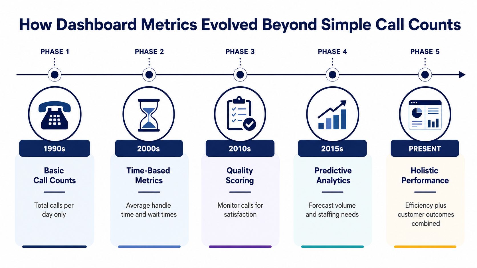
The earliest dashboards answered a narrow question, how many calls came in. That was useful when the main concern was volume tracking, but it was never enough to manage service quality. Modern dashboards now track the path of each contact across the workflow, which is a much more honest view of operations.
From call counts to workflow states
Today's dashboard measures don't stop at totals. They include queued, handled, handled in, handled out, contacts abandoned, average hold time, average ACW, and callbacks handled, as listed in Klipfolio's call center metrics overview. That's a major operational shift, because the team can see not just how many calls arrived, but what happened after they arrived.
This broader model matters in distributed support environments. When supervisors cover multiple locations, remote agents, and several queues, a single physical wallboard isn't enough. They need visibility into the whole contact path, including transfers, callbacks, and after-call work, because those are the points where service and cost both move.
Why the evolution matters
A call count tells you demand. A workflow model tells you where demand is getting stuck. That difference matters when the business wants to improve quality without adding noise to the process. If a dashboard shows only volume, supervisors end up reacting late. If it shows queue state and handling detail, they can intervene while the work is still live.
The modern value of a dashboard is that it supports both quality management and workforce planning. It shows whether the operation is efficient, whether repeat work is building up, and whether the team is handling contacts the way the customer experiences them. That's a very different job from tallying calls.
A quick way to sanity-check a dashboard is to ask whether it can explain the full journey of a contact. If the answer is no, it's probably still stuck in a legacy reporting mindset.
Dashboard Layouts Designed for Different Roles and Decisions
Not every person in a contact center should see the same screen. Agents need a view that helps them stay on task. Supervisors need a live operational panel. Executives need trend visibility that helps them understand whether the operation is improving or drifting.
A good design limits the real-time view to roughly 5 to 7 operational metrics and ties each one to a clear owner and threshold, which is a recurring recommendation in practical dashboard guidance from TabaTalk's dashboard examples. Too many tiles create hesitation, not clarity. The right layout depends on who's making the decision and how fast that decision has to happen.
Agent, supervisor, and executive views
| Role | Primary Metrics | Refresh Cadence | Key Action |
|---|---|---|---|
| Agent | Adherence, queue position, AHT, callbacks, occupancy | Frequent, but focused on personal performance | Stay in state, manage wrap-up, follow the schedule |
| Supervisor | Service level, ASA, abandon rate, agent availability, occupancy, queue length | Real-time | Reassign work, change routing, trigger callbacks |
| Executive | FCR trends, CSAT, abandonment trend, occupancy trend, service-level trend | Slower, trend-based | Review performance, staffing strategy, and process issues |
The agent view should be personal and simple. If an agent sees too much operational noise, the screen stops being useful. The supervisor view should show live pressure points, because that role exists to intervene. The executive view should focus on whether customer outcomes and efficiency are moving in the same direction.
The right screen supports the right decision
The question isn't just which metrics belong on the dashboard. It's what someone is supposed to do when a metric changes. A supervisor who sees service level drop needs queue-level context. An executive who sees weak FCR needs pattern-level insight, not a live alarm.
Key takeaway: dashboard design should mirror decision speed. Fast decisions need live views. Slow decisions need trends, history, and comparisons.
That's where governance matters. If every role sees the same wallboard, nobody sees enough of the context they need. If every role gets a custom view, the team can stop arguing about visibility and start using the numbers.
Real-Time Monitoring and Live Queue Management
Real-time monitoring only works if the data arrives fast enough to change the outcome. A dashboard that refreshes slowly becomes a retrospective report, which is too late for live queue control. Vendors that focus on operational monitoring recommend frequent updates, sometimes every few seconds, because supervisors need to act while call volume is still moving. Geckoboard's support dashboard guidance reflects that live-control mindset.
What the live screen needs to show
The live view should include current call volume, wait time, queue length, agent availability, and occupancy. In omnichannel operations, it should also show agent states such as Ready, Not Ready, Occupied, and Offline, plus queue-specific live waiting and callback waiting counts. That combination turns the screen into a control surface, not a passive dashboard.
The point is to make intervention obvious. If the queue climbs and Ready agents drop, the supervisor can rebalance staffing. If wait time rises faster than the team can answer, callbacks may be the better move. If a queue is overloaded, routing changes may protect the customer experience better than waiting for the spike to pass.
Thresholds should lead to immediate action
A real-time dashboard only earns trust when the team knows what to do at each threshold. If service level slips below the target, the supervisor shouldn't have to guess which lever to pull. The alert should point to the likely action, whether that means shifting agents, opening a callback option, or changing how calls are routed.
The same logic applies to occupancy. High occupancy isn't automatically bad, but it becomes a problem when it starts pushing wait times and abandonment in the wrong direction. That's why the live screen should be built around decision points, not around raw numbers alone.
For teams evaluating software, SnapDial's queue management software is one example of the kind of platform that can surface live queue data, callbacks, and operational reporting in a way supervisors can use.
If the dashboard can't show you who should move, what should change, and whether the change worked, it's not real-time enough.
Common Dashboard Pitfalls and How to Avoid Them
The most common dashboard problems are usually self-inflicted. Teams add too much, keep metrics nobody owns, and then wonder why the screen gets ignored. The dashboard still looks impressive, but the operation doesn't improve.
The traps that kill adoption
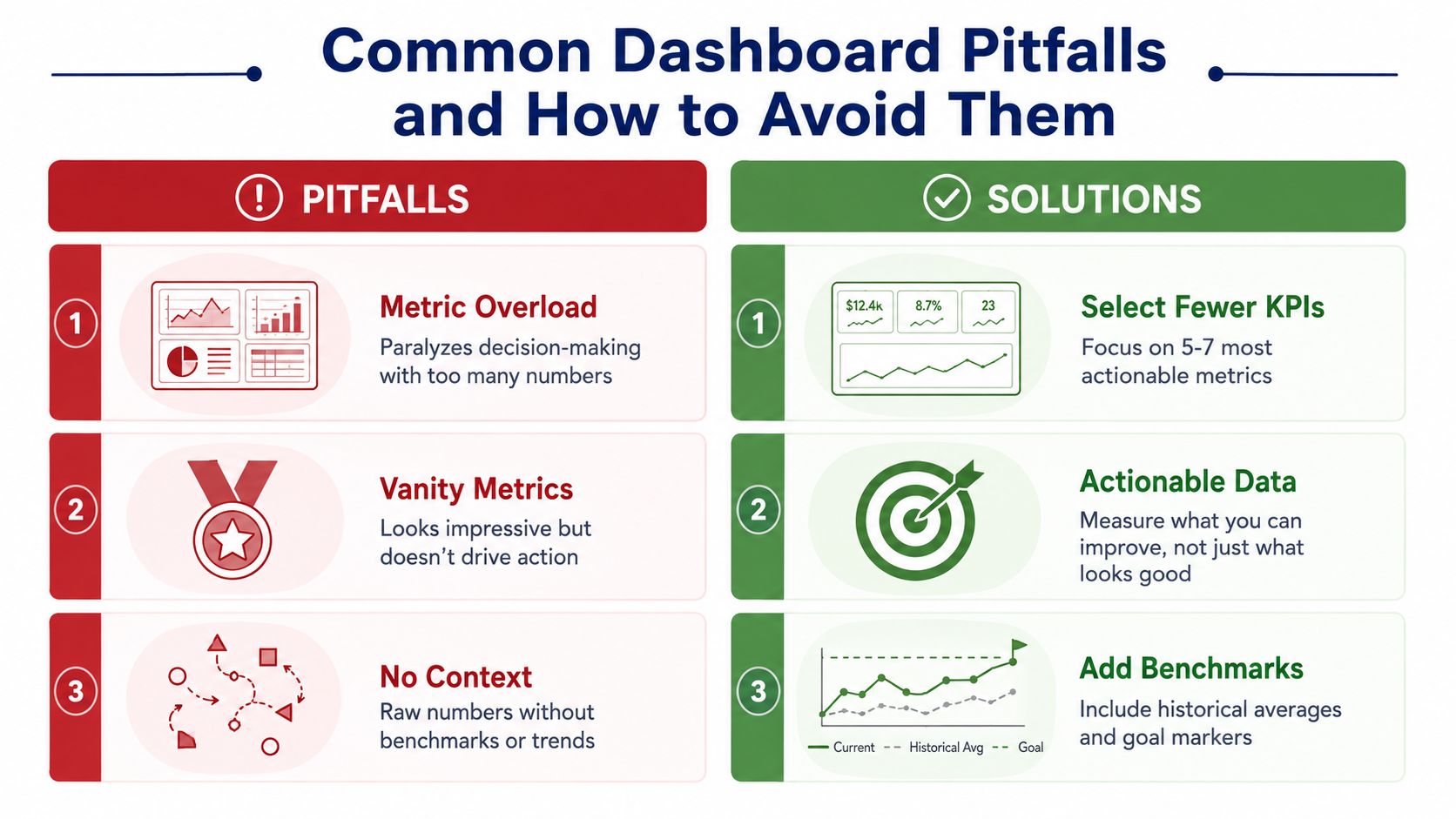
Metric overload is the first trap. A screen with too many numbers slows down the supervisor, especially during a spike. Vanity metrics are the second trap. They may look polished, but if no one can act on them, they don't belong in the live view.
No context is the third trap. Raw numbers without benchmarks, thresholds, or trends leave people guessing about whether the operation is healthy. That's why the most effective dashboards keep the field of view tight and tie each metric to a reference point.
Governance fixes the clutter problem
Recent guidance on customer-service dashboards emphasizes separate views for agents, supervisors, executives, and workforce planners, along with refresh cadences matched to decision speed, as noted in Fanruan's dashboard guidance. That's the right way to think about ownership. Each role needs the data it can use.
A practical audit starts with three questions. Who is this view for? What decision does it support? What happens when the metric changes? If the dashboard can't answer those questions clearly, it needs to be trimmed.
- Select fewer KPIs: Keep the live view focused on the few measures that drive intervention.
- Assign ownership: Make sure each metric has a person who acts when the threshold is crossed.
- Add benchmarks: Show target markers and history so the number has context.
- Match refresh to use case: Fast-moving decisions need fresh data, slow-moving decisions don't.
A dashboard isn't successful because it's complete. It's successful because people trust it enough to change behavior when it moves.
Implementing Dashboards with a Hosted VoIP Platform
A practical dashboard usually starts with the phone platform, because that's where the live call data lives. Hosted VoIP systems can provide the reporting backbone for real-time statistics, detailed call logs, queue data, and callback events, which is exactly what a working dashboard needs. SnapDial's hosted VoIP solutions are one example of how that data can sit inside a cloud business phone stack instead of being stitched together manually.
Start with the data you already have
The cleanest implementation path is to pull call logs, routing outcomes, recordings, and live queue state into one dashboard layer. That gives supervisors a view of what happened, what's happening now, and where the bottleneck is forming. It also reduces the temptation to build a dashboard around whatever the system can export most easily.
The first rollout should be narrow. Build the five foundational KPIs, add threshold-based alerts, and give supervisors a queue view before you give everyone a full analytics suite. That keeps the rollout usable and makes it easier to see whether the dashboard is changing behavior.
Roll out in phases
A phased launch keeps the project grounded. Start with the operational screen for supervisors, then add an agent view for personal performance, then add an executive view for trend review. That order matters because live operations usually need help first.
A simple launch checklist helps:
- Map the decision: Decide who will use each view and what action they'll take.
- Choose the KPIs: Start with service level, ASA, AHT, abandonment rate, and FCR.
- Set thresholds: Define the point where the dashboard should trigger intervention.
- Connect the data: Bring in logs, queue state, callbacks, and reporting fields.
- Limit each view: Keep role-based screens focused on the metrics that matter to that role.
That approach works because it respects how contact centers run. Supervisors need live control, agents need clear personal feedback, and leadership needs trend visibility. When the dashboard matches those jobs, it stops being a reporting project and starts becoming part of daily operations.
If you're ready to turn dashboards into real operational control, SnapDial can help you build around live queue data, detailed reporting, and role-specific views that teams can use. Visit SnapDial to see how its hosted VoIP platform supports call center dashboards that are built for action, not just display.